
Nossos Serviços
Estamos prontos para atendê-los!

Plantão Técnico
Central de Atendimento

(62) 3945-0338
Segunda a Sexta
das 8:00 às 19:00h
das 8:00 às 19:00h
Sábado
das 8 às 12:00h
das 8 às 12:00h
(62) 9686-8205
Segunda a Sexta
das 19 às 22:00h
das 19 às 22:00h
Sábados
das 12 às 18:00h
das 12 às 18:00h
Domingos e Feriados
das 8 às 12:00h
das 8 às 12:00h


Fale com o suporte técnico


Serviços especializados para
viabilizar seu projeto de
automatização.
Na Syndata você encontra
profissionais especializados em
Automação Comercial e Fiscal. Um
mix completo para o seu projeto.
Solução completa em serviços para Automação de seu negócio!
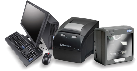
Manutenção e Assistência Técnica em computadores
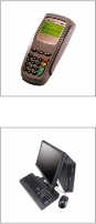
Instalação e manutenção em TEF (Cartão de Crédito)
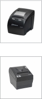
Manutenção/Lacração em Impressoras Fiscais e produtos Elgin
Auxílio em Manutenção/Lacração de Impressoras Fiscais e produtos Bematech